Thursday, July 12, 2012

SWISS STUFF

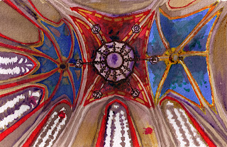
Painting of the Chapel of the Macchabées in Genève.


So, first of all, I'm in Switzerland. If you follow me on any other social media, you probably know that, and you've probably LONG SINCE given up hope of any updates here.

Here is the rundown:

1. Why am you in Switzerland?

I was asked by my MIT thesis advisor and research supervisor, who now heads a lab at the Ecole Polytechnique Fédérale de Lausanne (in English that's the Swiss Federal Institute of Technology in Lausanne), to do a three-month internship in her lab over the summer. She also asked if I was interested in applying for a Master's of Science program in Energy Management and Sustainability, which would allow me to continue to work with her. I did, and I was accepted in early June.

2. How long will you be in Switzerland?

Probably until May 2014, with occasional trips home.

3. Do you speak French?

No. I am learning. It is awkward. Also at the university a huge percentage of people speak English.

4. But how do you manage in restaurants?

I don't eat out because Switzerland is even MORE expensive that Japan. Otherwise, I point and smile. This is pretty universal.

5. What's Lausanne like?

Very steep. I live near the city center, which is very charmingly medieval and very bad for your ankles. Nothing is open on Sundays except the Coop Pronto. From many places in the city there are gorgeous views out over Lac Leman (or Lake Geneva) to the blue Alps on the other side.

6. Have you done much traveling?

Not so much so far. I went to the Chateau de Chillon, which is on the east end of Lake Geneva, on a boat ride. I went to Fribourg (an attractive Swiss town about 40 minutes north of here) one Sunday, but it was incredibly rainy, so I ended up coming home after about two hours. Last weekend I went to Marseille, which made me remember how exhausting traveling on a tight schedule and a tight budget is. (I also missed every train I planned on catching and usually ended up on a train 3-4 hours later, so that probably contributed to the stress level.) At the end of August I am going to Rome for five days. Before then I plan to go to: Zurich, a castle some of my labmates recommended to me in Switzerland, and probably another weekend in Geneva. (Due to the aforementioned train-missing, I spent the morning in Geneva on Saturday. Sigh.)

7. What do you do in your internship?

I research daylight-interacting technologies (like fiberoptic systems that collect sunlight and use it to light regular fixtures inside a room, for instance) and enter them into a visual database for architects.

8. How are things?

Things are pretty good. I really enjoy having my own space again. I have not yet found a place to live for the fall, but I am actively moving toward that point. I went to an English-language book club. I've read a couple books. I've written a couple stories. My labmates are pretty cool. I went to an English-speaking church. I have my bank account set up. (SWISS BANK ACCOUNT! Except it's with the post office, so that makes it less dramatic.)

In short, I'm starting to craft a life here.

Monday, April 16, 2012

a random post of updates.

Hey, horse eating hay in the Old Market. How's it going. Make any important life choices recently?

Well.

I have not been keeping up here as well as I might have. Forgive, forgive, I beg you to forgive, and so on.

MANY THINGS have happened. SO MANY THINGS, so I shall give you a brief (if scatter-brained) post about as many as I can think of.

First: Many persons who know me are probably aware at this point that I am possibly going to be doing an internship in Lausanne, Switzerland, this summer. If all my visa paperwork goes through correctly, I will be starting June 1 with the same professor I did daylighting research with undergrad for three months. I also applied to a two-year energy management and sustainability program at the school she now teaches at, EPFL, and if accepted I may be staying in Switzerland for a bit.

SO THAT IS VERY EXCITING.

Second: Illustration continues apace. I am back at the Hotshops in Omaha doing life drawing once a week (you can see several weeks worth of work and experimentation here), and I think I've improved noticeably from last year. My illustration production has slowed somewhat (more on the reasons for that later), but I've finished some new paintings, including a still life, a the proscenium at the Rose Theater, and some of the Durham Western Heritage Museum architecture. I'm working on another painting now, and have a lot of ideas for things to try in the next month and a half (though I am making sure all my art supplies are portable so I can trundle about Switzerland sketching and painting if possible.)

I was in my first show this month, at the Center in Council Bluffs, Iowa, with the plein air group I painted with 2-4 times a month from October to February. I have twelve pieces in the show, which is up until April 30. Yesterday we held an artists' reception in the afternoon, and I sold two paintings and six prints, so I am quite excited about that.

Third: Writing continues apace. I am still working on my book (bit stuck on it, to be honest, so I've been developing the outline), but I've also written three (and a half) short stories and submitted them to magazines.  The first was an attempt to be literary and local, and the second two were fantasy (and I recalled the reason I write fantasy, which is that it is SO MUCH EASIER.) So far I have no takers, which is rather discouraging, but to be expected, I suppose. (I did burn my first official paper rejection notice in my mom's Christmas Yankee candle, so that made me feel a bit better.)

The Kansas City Design Week experience did yield up three articles for This Big City blog: one about the graphic identity of the city, one on density and transportation, and one on interpreting architectural history.

Fourth: I have had some adventures! I went back to Kansas City for a weekend two weeks ago to spend time with a friend; we went to the Kemper, walked about Westport, and went to the new H&M (I got a sweater! DON'T JUDGE ME.) In two days I will be going to a live performance by Eric Hutchinson and Graffiti6 at the Waiting Room in Omaha, which admittedly I bought a ticket to because a. they were cheap and b. I like Graffiti6 (though after finding some music by Eric Hutchinson on Grooveshark, he's not too bad either.)

I continue to work and hope and plan! Hopefully I will have more and more interesting posts soon.

Friday, March 9, 2012

Kansas City Design Week -- part 4: nonlinearity

FIRST OF ALL (and here is the nonlinearity): I want you to go to the first post I wrote on KCDW for This Big City blog and read it. It is about branding! Graphic texture! Go read it.

Also, I wanted to note (in case I didn't before) that it's thanks the Kansas City Development Council and Hotel Phillips (who apparently donated a bunch of rooms for various speakers/attendees of KCDW) that I was able to go on this trip at all. I am appreciative.

Now, on to discussing my fourth and final day at KCDW! Ironically, though this was an incredibly packed day (two events and driving home), I didn't end up taking too many pictures. 

In the morning/lunchtime I attended the "Design Psychology" event at Johnson County Community College. Guess what! JCCC is in Overland Park, which is waaaaaay south and west of downtown Kansas City, and also in KANSAS. I wanted to stop at Union Station before going, because if you Google "Kansas City" the first ten pictures or so are all Union Station. (I exaggerate, but you get my point.) It's also a cool point of reference, given that the last time my mom remembers driving by it, it was derelict and unused, but now they've renovated it and cleaned it up so it is both the actual Amtrak station and has a number of little shops and restaurants. It was pretty empty when I was there, but maybe mid-day on a Tuesday isn't its most bustling time. I love railroad stations. Except for North Station in Boston. I do not love that station. 


Entrance to Union Station, built in 1914, when there were twelve railroads going through KC.
See, to me, this ceiling pattern just screams "We're on the verge of Art Deco but we're not quite ready to make the leap." But maybe that's just the paint job.

Tuesday, March 6, 2012

Kansas City Design Week -- part 3: The sandwich


For various reasons yesterday (working on blog article, waiting on interview scheduling, etc.) I did not go out much yesterday. However, I did go to Arthur Bryant's to get a pulled pork sandwich, such that I would not have failed in my barbecue consumption duties.

It was very tasty.

Monday, March 5, 2012

Kansas City Design Week -- part 2: The West Bottoms


In the interest of getting something posted, this is going to be a picture-heavy, text-light entry about the walking tour of the West Bottoms neighborhood that I went on yesterday, led by the very knowledgeable Cydney Millstein, an architectural historian and preservation consultant who works in Kansas City. The vast majority of the information in this post came from her talk.
Sketched this while sitting in my car and waiting for the talk to begin. Not my best sketch, especially given that the wall actually said "STANDARD SEED CO./GRASS FIELD AND GARDEN SEED" rather than what I drew it as. . . . There's a monument to the railroad on the left and a monument to slaves who escaped through this neighborhood to Kansas just out of the frame on the left of that.
The West Bottoms is akin to Omaha's North Downtown or Old Market -- an industrial neighborhood with close ties to the river and the railroad, originally a home of factories, warehouses, and stores (and in both cases, one of the major train stations), which since the height of their commercial importance have fallen into disuse. In Omaha's case, the Old Market has largely been revamped into a trendy area of restaurants, boutiques, and expensive housing, while the North Downtown remains in a state similar to the West Bottoms -- a few artists' studios, a few stores, and a lot of buildings that are either abandoned or appear disused. (Unlike Omaha, the biggest stockyards in Kansas City were also found in the West Bottoms, whereas I am pretty sure Omaha's stockyards were mostly in the southern part of the city.)

1895 birdseye view of West Bottoms
1895 view of the West Bottoms

Sunday, March 4, 2012

Kansas City Design Week -- part 1

A view from my hotel window.

Well, first I'd like to extend an apology to anyone who at previous times has enjoyed reading my musings or looking through the pictures on my blog. I have been writing a ton about a ton of things, but unfortunately, it has not been on this blog.

In recent days I have written ~20 pages of my book, two short stories, drunk roughly my body weight in cinnamon tea, read a number of amazing books, and -- (and here we come to the point of this post) -- volunteered to cover a few events of Kansas City Design Week for This Big City blog.

Tuesday, January 24, 2012

LINOLEUM PRINTS: the beginning of an epic adventure

Let's talk about linoleum printing.

First, I'll admit: I really had no idea what I was getting into with linoleum printing at all. All I really knew was that I had come across some really cool limited edition art prints (like this one and this one) and thought, "Hey! Those look really cool! I should do that!" One can, of course, reproduce similar effects using Photoshop, but for someone like me who is still more or less a novice in the illustration world, the easiest way to get nice textures is to . . . use real materials.

If you clicked through to the links, you'll note that neither of the two prints I was inspired by were actually linoleum prints -- the first was a letterpress print, and the second was a screenprint. I really like both of those styles and hope later to be able to make prints that way, but a letterpress requires an actual wooden press (thus the name) which would require either a lot of money or time to construct. As far as screenprinting goes . . . essentially you use a light-exposure technique to create a stencil of your design on a cloth screen. For reasons best known to myself (ha), I decided to start with something I had done (sort of) in middle school art class instead (hey, we carved little 2"x2" stamps out of rubber), because the principle was more straightforward and I was more confident in myself not to screw it up. I watched the Dick Blick videos (yeah, I know) here and here and decided that I could handle a process that was more or less making a giant stamp.

There were a few things I did not bargain on; one is that it's much harder to transfer an image exactly with linocut, because you are drawing it twice, more or less -- once with pen on the block, and once with the lino cutter as you chisel out the unwanted pieces. I also found that it's sort of a bad idea to draw the image on a different piece of paper, because the level and type of detail one gets with a pencil are not the same as the equivalent with the cutter. At some point I will probably learn to screenprint as well, in no small part because I also didn't figure on this:
This is a linoleum cutter, sketched very handily with my new tablet (heh, I'm learning new artsy things all over.) What it also represents is a tool that will make you lose feeling in your hands if used excessively, which I most certainly did in the first few days of experimentation. Screenprinting, I think, is less likely to cause muscle strain. The little cheap Blick-brand cutter I bought for $7 came with five blades; so far I've use mainly the deep V cutter (enough that I ordered another box of them rather than risk the one I have getting too dull to use) and the deep U cutter. I also decided to use Blick blockprinting ink, the main attraction of which is its relatively low price. I think at some point I will switch to oil-based rather than water-based ink, because this ink dries extremely quickly (meaning that I waste a lot by the time I get it spread out), and smudges very easily if I try to add other paints or color on top of the print.


Here are some photos from my first print, which was sort of cute but in several ways was moderately disastrous. Note: Do not attempt to make a heavily detailed two-color print on the first go. It's just not a great idea.


One of Mom's old pan lids got commissioned into service as a linoleum shred catcher/inking plate. I bought a bench hook, but have not really used it a lot yet. This was the second color. . .


And here is me trying (somewhat hopelessly) to line up the second color with the first. It was a miracle it worked as well as it did, but it still came out . . . kind of goofy. This print series ended after about three.

Saturday, December 31, 2011

2011 in review

Is this for me, or for you? WHO KNOWS. In any case, here you go: a tremendous but tremendously fragmented year.

Wednesday, December 14, 2011

merry Christmas from the style factory

The jury is sadly still out on whether I am going to get Christmas cards out before Christmas. Still, at least now I have a card to send.

Ugh sorry for the lack of text but I am not feeling very smart right now.

BEHOLD, I present to you: THE BIBLIOPHILE'S CHRISTMAS.


Sunday, December 4, 2011

Merry Christmas from the fluffiest of folk

i.e. Sparkle and Rosie the Shih Tzus. 

My grandma requested me to make her a Christmas card featuring her dogs. I thought it would be nice to brush up on my acrylic painting skills, so I did this painting Friday and Saturday (though I started the sketch right after Thanksgiving, eep.)


A few process photos after the break -- it actually went together so fast that I didn't really have time to take a ton of photos. 

Friday, December 2, 2011

Mycenaean Holiday inspirations: Fun times were had by all

First things first; I have a design up on Threadless to be scored for the "Dysfunctional Families" design challenge. Rather mysteriously I decided the thing to do would be to make a Greek mythology joke -- not, I would argue, a particularly obscure one, but still, probably less accessible overall than a joke about, say, the Kardashians. Whatever.

Here is my design! And here is a link where you can go give it a nice score on Threadless! (You need a Threadless account to vote.)


Now, let me justify this business.

My roommate took a "Women in the Ancient World" or somesuch class when we were juniors or seniors, and she would come home positively crowing about the murders of Medea or Clytemnestra (not that we have macabre senses of humor or anything.) I always particularly enjoyed seeing Agamemnon get his comeuppance, because he always seemed particularly like an ass (particularly after that television miniseries we watched in high school World Lit with Rufus Sewell as Agamemnon, cough). Not only that, there were enough murders in that story to make a truly ridiculous graphic. (Agamemnon kills his daughter Iphigenia in a ritual sacrifice for favorable winds when he's taking his army to attack Troy; his wife, Clytemnestra, avenges her daughter by strangling/stabbing him in the bath; and finally, their son, Orestes, kills her to pay back his father's death.)

The idea of having all four pagan folk together murdering each other in a chain reaction, decked out in anachronistic holiday swag (though you'll notice that the tree has a lightning bolt on top and dolphins and bulls hung from the branches) struck me as quite humorous.

The nice thing about pulling a story from a culture with a strong tradition of graphic representation is that it makes deciding how to draw it much simpler. I wanted to mimic the sort of figures one sees drawn on large Greek vessels, of which the Boston MFA has a large and admirable (if occasionally risque) collection.

I started poking around in their online archives for ideas. (I used links to their websites for the images, so hopefully they don't break in the near future. :P) (Whoops -- editorial note -- the links on the MFA items lead back to the slideshow these pieces are found in, not the specific piece. It's not a very long slideshow though so you should be able to find them.)


This one is a bowl for mixing wine and water from Athens (called a bell krater, I think?), ca. 470 B.C. The figures represented are Diana and Achteon; the myth goes that he saw her bathing, so she turned him into a stag to be ripped apart by his own dogs. I more or less copied her dress for Iphigenia (minus the skin of a -- cat? -- around her neck.) Click through on this link to look at a bigger picture of Diana's hands -- they're very gracefully shaped, and I tried (and perhaps failed) to do justice to that in my design.

Monday, November 28, 2011

if you want to hop on over to my "things to buy" page. . .


You'll find that I've added "Bostonia" notecards to my shop! A Christmas present for someone perhaps?

Sunday, November 27, 2011

Bostonia watercolor: the very long process post

ETA: Crap, I knew I forgot something. You can now purchase this painting as a print, laptop skin, iPhone skin, or iPhone case on Society6.


So here -- after about five days of work -- I present to you, the Bostonia watercolor process post! It is very long, which hopefully will convey to you how annoying the linework was to complete.

Thursday, November 24, 2011

WHOO BEEF


This is the first year my brother and sister-in-law are hosting Thanksgiving. My brother doesn't like turkey, so we're having prime rib.

Happy Thanksgiving, guys.

Wednesday, November 23, 2011

a fallish outfit

The truth is, I haven't been dressing up too much since I've been home, despite ample opportunity (movies, plays, excursions out to eat, etc.) I fear I have been afflicted by at-home-slackification, as well as overcast sky exhaustion.

Last night I felt silly so I put on heels for my own amusement. Et voilà, my first . . . er. . . fashion illustration!

a small preview of what I've been working on


Certainly not done yet . . . but the linework is almost finished.


Monday, November 21, 2011

Lavender davender spavender

Loess Hills Lavender Farm

If you are in the Harrison County area and interested in buying singles or packs of my lavender cards (without shipping! whoo!), they will be available at the Loess Hills Lavender Farm Christmas Open House in two weeks. The Lavender Farm shop will be open on Sunday, December 4th, from 1 pm to 6 pm; Monday, December 5th, to Saturday, December 10th, from 11 am to 7 pm, and Sunday, December 11th, from 1 pm to 6 pm.

I personally will be probably be running over to grab some thick lavender lotion -- my almond lotion bar is almost gone, and my hands need some help.

view into the lavender valley

Saturday, November 19, 2011

questionable packing practices

At right: The box I received today from Blick Art Supplies.

At left: The half-pan of yellow Winsor-Newton watercolor that said box contained.

What.


Friday, November 18, 2011

first two orders of cards shipped. also, Pegapup Christmas card ideas. also, pie. also, bread.

PROGRESS.

This is the second order. Actually I shipped my third order today but I didn't take a celebratory picture because it needed to be rush shipped.

Here we come to my Pegapup Christmas card (or holiday card if you like, as I don't really feel inclined to put writing on the inside) ideas. I have two. This is the first one.

If this looks like a card you would like to buy and send, please leave a comment to that effect on this post. They would be more expensive ($3.50 apiece, or 5 for $16) than my regular cards because of the cutting involved. In the next day or two I will also be posting my other Pegapup Christmas card idea.

new Society6 products

Hopefully I have a better blog post coming later today, but first:

I spent some time today resizing some of my Society6 artwork for the other product they sell -- i.e. laptop skins, iPhone skins, t-shirts, and hoodies. I'm hoping that in a couple days I'll have all of them reformatted.

I though two pieces in particular looked really nice -- the "My Dear" laptop skin and the "For the Heart-Hungry" iPhone skin. 


Wednesday, November 16, 2011

a brief and serious diversion.

Please consider emailing or calling your Congressperson today to protest the IP-Protect Act and SOPA. They are ostensibly to protect copyright holders from piracy, but they give large-scale Internet censorship powers to the entertainment industry. 

I encourage you to watch the video with more information and use the easy form to call or email your representatives here or to sign the Change.org petition here.

Reasons I care:

1. This bill could be used to block access to social networking sites like Facebook, Tumblr, and Twitter, making it harder for new startups to publicize themselves and make new connections;
2. This bill would cost about $47 million to implement (and our government just has SO MUCH SPARE CASH LYING AROUND THAT COULDN'T POSSIBLY BE USED FOR MORE IMPORTANT THINGS /sarcasm);
3. This bill could be used to deal out major punishments (like jail time) for minor infractions of copyright law (like using a copyrighted song in the background of a Youtube video);
4. This bill helps create an atmosphere of fear and repression of ideas on the U.S. Internet. 

That is not good. 


Tuesday, November 15, 2011

the recovered sketchbook! (MUCH CAPSLOCK ENSUES)

So. At this point I have told this story multiple times, because it's so unbelievable and awesome as to merit repeated enthusiasm. What happened is this: The first few days of the Fontainebleau program -- back in July -- were spent in Paris. We toured around with our instructors and TAs to design and architecturally significant locations and learned stuff about the history, urbanism, development, and (occasionally) the politics of Paris. We ate many sandwich-filled picnics and saw many glorious sites. We also had free evenings and a free afternoon with which to explore.

ALL OF THIS WAS GREAT, EXCEPT that the day before we were going to leave to go to Fontainebleau to start the project part of the program, I LOST MY SKETCHBOOK.

THE SKETCHBOOK I HAD BEEN WORKING IN ALL THROUGH MY KYOTO INTERNSHIP AND WHICH  I HAD JUST DONE SEVERAL VERY NICE PARISIAN SKETCHES IN.

Understandably (I hope) I was PROFOUNDLY UPSET. I tore through the hostel looking for it; it had been in my bag up until that point and I had no idea where I had lost it.

I finally resigned myself to the fact that my glorious sketchbook was gone, bought another Moleskin, and grumpily went about my business.

FAST-FORWARD: Last Saturday my Grandma called me. "I got a piece of mail that I think is yours."

"What?" (This didn't really surprise me, as we have the same first name and last name.)

"Yeah, it's some kind of journal."

"Oh?" (This is me thinking a medical journal or similar magazine, so not too excited yet.)

"Yeah, it's full of sketches and stuff."

"WHAAAAAAAAAAAAAAT." (Much screaming commenced. Okay, that's a slight exaggeration. BUT I WAS SCREAMING WITH GLEE INSIDE.)

So: Three months after the fact, the staff of the Musée de Cluny had spent 7.10 Euro (so $10-$11) to MAIL THE SKETCHBOOK I HAD LEFT IN THE MUSEUM BACK TO ME.

If it's any indication of how thrilled I was, I mailed my thank-you note today. I am never that timely.

To the punchline! I have decided to scan and upload the best (well, most of) the sketches from said notebook for your viewing pleasure! AND HERE THEY ARE.


This is Tofuku-ji, a temple known for its rock gardens in Kyoto. It was on the east bank of Kamo River (same as my apartment and place of work), but a few miles south.

Monday, November 14, 2011

you have noticed: NOTECARDS (also, PEGAPUP!)

You may have noticed the new button at the top of the blog -- Things you can buy. Well, currently, "things" means "notecards." I am now selling notecards with my art on the front, each printed on bright white matte heavy cardstock or Bristol board with a white envelope. They come in packs of five cards for $10 or eleven cards for $20, plus shipping. So far, I have a mixed Iowa watercolor pack, a mixed black-and-white travel sketches pack, a Purple Up Over the Hills pack (the painting I did at the Loess Hills Lavender Farm), a The Only Way Out Is Up pack (the painting I did lying on my back at the Gleason-Hubbell nature area), and a A Few Reflections on an Elegant Curve pack (the print I made with my drawing of one of the roofs at Yoshida shrine in Kyoto.)


I spent today cutting, folding, and assembling cards. (Somewhat relieved that I didn't give away all of my architecture tools.)

There's one more pack that appeared today -- the PEGAPUP pack.

What is Pegapup, you ask?

Pegapup is a little doggie with wings I drew a few nights ago before bed. More or less he came about by way of, "Gee, wouldn't Stubby look cute with wings?"


This gave birth to more Pegapup cartoons depicting the slightly glamorized life and times of Stubby the Frequently Sleepy Dog as his winged alter-ego.

Sunday, November 13, 2011

the desk

Currently the hub of my existence.

top view of my desk with watercolors, computer, and so on


Saturday, November 12, 2011

pumpkin roll recipe

IN CASE YOU WERE IN NEED OF SOME FALL GOODNESS.

(adapted from the skeleton of the cinnamon roll recipe in the Williams-Sonoma Baking book.)
1 CUP milk. I used skim, but whole is nice too.
Heat up the milk in the microwave (45 seconds - 1 minute). Add a dollop of sugar; stir until it dissolves. Sprinkle over the top:
7 TEASPOONS of dried yeast.
Let that sit until bubbly (10-20 minutes).
While the yeast is doing its thing, dump
1 12-oz CAN of pumpkin
in a bowl. Add
4 eggs
1/2 CUP of white sugar
1/2 CUP of brown sugar
4 TEASPOONS salt
4 TEASPOONS (give or take a bit, can add some more cinnamon) pumpkin pie spice
3/4 CUP butter, melted
STIR. Add yeast mixture. STIR MORE.
This is where it gets a bit tricky, because I always just add flour until it gets to be the right consistency — I don’t pay attention too much to how many cups. So, I would advise that you add AT LEAST 
7 CUPS of white flour. Mix/knead this into the dough, then start adding flour one cup at a time and keep kneading until the dough is firm but not stiff. I used about 10 cups eventually I think. 
Put dough in a greased bowl and let rise for 2-3 hours, until soft and puffy.
For the filling:
1/2 CUP butter, softened (22 seconds or so in the microwave and stir)
and… about. . . 1/2 CUP brown sugar?
Split the dough in half. Roll it into a large flat rectangle on your workspace, something like 20” x 12” (exact dimensions don’t matter, it just needs to be longer than it is wide and big and flat.) Spread 1/4 cup of the softened butter across the rectangle, then sprinkle with as much brown sugar as seems appropriate to you. I suspect I actually used about 1/2 cup for EACH half to make sure it was nice and evenly coated, but I’m not sure. Roll up the rectangle and cut into between 12-20 rolls, depending on big you like your rolls. Separate the rolls on the pan if you like crisp sides, and put them closer together if you like soft sides. Let them rise in the pan for another 20 minutes to an hour, ideally whilst the oven is heating up to 350 degrees F. Bake for 20 minutes (this was just about perfect on all three pans I made.)
We put about 1/2 tablespoon of commercially ready dipping caramel on each one while it was hot; it melted down and made delicious sticky topping. If I come across a good recipe for soft caramel sauce, I’ll share it.
This recipe makes 24-40 rolls, depending on into how many pieces you cut each of the two long rolls you make.